Soundboard Calibration for Workshop Natural-Light Conditions
The Match That Changed Seasons
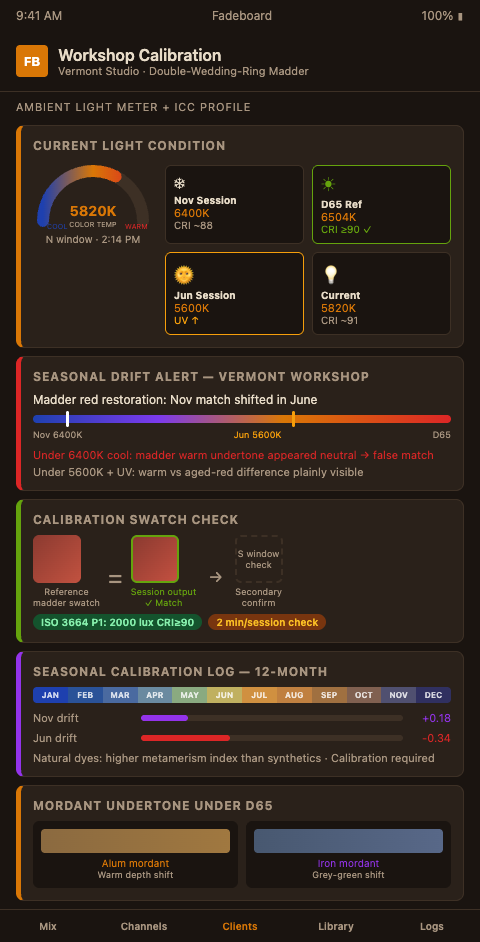
A workshop in Vermont completed a madder red restoration on a double-wedding-ring quilt in late November. Under the workshop's north window at that time of year, the corrected panels matched the reference corners closely. The client collected the piece in February and brought it to a conservator in June after noticing the restored blocks read slightly warmer than the originals under summer window light.
The conservator identified the problem immediately: the November workshop lighting had a color temperature of approximately 6400K — very cool, heavily blue-shifted — which had made the madder's warmer red undertone appear more neutral. The reference corners, which had aged to a slightly different red, looked like a match under that cool light. Under June's 5600K daylight with higher UV content, the undertone difference between original and restored was plainly visible.
Illuminant metamerism causes dye matches under one light source to fail under another; studio calibration is essential. For quilt workshops that cannot control their ambient light — most cannot — the only solution is to calibrate the Fadeboard session to a known reference condition and check all matches against that reference before approving a session's output.
Natural dyes produce a higher metamerism index than synthetic dyes. This means that color matches made with natural dye baths — which are the appropriate dyes for heirloom quilt restoration — are inherently more susceptible to illuminant metamerism than matches made with synthetic dyes. The workshop that moves from synthetic to natural dye practice for historical accuracy takes on a corresponding increase in lighting calibration responsibility.
Calibrating Fadeboard to Your Workshop Light
The calibration principle is straightforward: every Fadeboard session should be assessed under a reference light condition that remains constant across the year, and that reference condition should be the one the finished piece will most often be displayed in.
ISO 3664 sets critical viewing conditions at 2000 lux with CRI ≥90 for P1 color assessment, and 500 lux with CRI ≥90 for P2 practical appraisal. For most quilt workshops, achieving P1 conditions requires a dedicated viewing panel — a portable D65 lightbox or a CRI ≥90 LED panel mounted at a fixed position in the workspace. The ambient natural light from the window continues to be used for general work; the reference panel is used specifically for color-critical assessments, including fader calibration checks and bath output evaluation.
Color rendering index measures how accurately a light source reproduces colors relative to a natural reference; CRI ≥90 is required for critical textile assessment. A workshop that currently uses whatever ambient light is available has an effective CRI that varies from approximately 85 (overcast December) to 100 (clear noon June) depending on season and time of day. The variation is large enough to affect dye assessment decisions.
Fadeboard's calibration workflow is built around a calibration swatch — a small piece of the same cotton or wool fabric as the project, mordanted to the same alum or iron standard as the project, dyed to a known reference depth at the start of the session. Before every color assessment, the restorer places the calibration swatch alongside the project panel under the reference light and verifies that the swatch still reads at its reference depth. If it does not — because the ambient light has shifted, or the reference panel bulbs have aged — the calibration is flagged and the assessment is deferred until the lighting is corrected.
This calibration discipline is particularly important for workshop growth documentation contexts where multiple practitioners are working at different times of day. A morning session and an afternoon session on the same project can produce color decisions that look identical in their respective lighting conditions but differ visibly when the panels are placed side by side under a single reference light. The Fadeboard calibration swatch catches this drift at the session level rather than at the project completion level.
Different light sources used at each production stage cause color discrepancy; standardizing to D65 eliminates stage-to-stage errors. For a multi-month quilt project where the workshop may run 15 to 20 separate dye sessions, the cumulative effect of session-to-session lighting variation is a progressive shade drift that is invisible within any single session but visible across the finished piece.
Advanced Tactics for Natural-Light Calibration
Seasonal calibration log. Rather than treating calibration as a one-time setup, maintain a seasonal calibration log as part of the Fadeboard session record. At the start of each month, run a calibration swatch at a known reference recipe and compare the result under the reference panel. Note any drift — the swatch result versus the expected result — and adjust the session lighting protocol accordingly. Over one year this log provides a map of your workshop's lighting variation that allows prospective compensation.
Window orientation adjustment. If the workshop has both north and south windows, establish a protocol for which window to use for which type of assessment. Artificial daylight sources vary from true daylight; dye matches fail when moved from studio to window. North window light is cooler and more consistent across the day; south window light is warmer and more variable. For initial fader calibration, use north window in combination with the reference panel. For final output assessment, check under south window as a secondary confirmation — if the match holds under both, it will likely hold under the client's display conditions.
Mordant-response calibration. Lighting affects not just color depth perception but mordant response assessment — the gray-green shift from iron mordant versus the warm depth shift from alum mordant looks very different under cool versus warm light. A panel that was iron-mordanted will look appropriately warm under incandescent light but slightly cold under D65, even if the dye result is correct. Fadeboard's mordant-annotation field should include the expected undertone under D65 so the restorer can distinguish a lighting mismatch from a dye mismatch.
LED stage calibration parallel. The quilt workshop lighting problem has a precise parallel in stage performance venues: soundboard calibration for LED stage lighting conditions addresses the same challenge of calibrating color assessment against a reference when the working illuminant is variable. The core principle — establish a fixed reference condition, check against it at the start of every session — is identical.
Museum quilt loan verification. When a restored quilt is being prepared for museum quilt loan documentation, the condition report should note the lighting conditions under which the color assessment was made. A museum receiving a loan piece will assess condition under D65 reference lighting; if the workshop assessment was done under significantly different conditions, the museum's condition assessment may flag discrepancies that are artifacts of the lighting change rather than problems with the restoration.
The Reference Panel Is Not Optional
The most common objection to workshop lighting calibration is that it adds time and equipment cost to a workflow that is already demanding. The response is that it removes re-work time — the color assessment session that discovers a shade drift after three months of work is far more expensive than the two minutes per session required to check the calibration swatch.
Fadeboard's calibration discipline is also its documentation discipline. A session that includes a calibration swatch check creates a record that the color assessment was made under a known, repeatable condition. That record is part of the restoration documentation and matters when the piece is assessed by a conservator, insurer, or museum loan committee.
Workshops implementing natural-light calibration for the first time should start with a CRI ≥90 D65 panel — available from color-matching suppliers for under $400 — and a set of calibration swatches dyed at three reference depths (light, medium, deep) in the most common dye families the workshop uses. The calibration check adds two minutes to the start of each session. The confidence it provides is worth substantially more.