Designing Educator Dashboards That Surface Bypass Patterns
What Most Museum Dashboards Don't Tell You
Your current reporting infrastructure probably tells you how many visitors came on Tuesday, which exhibits saw the most traffic overall, and how your attendance compares to last quarter. What it almost certainly doesn't tell you: which stations the 10:15 AM third-grade group from P.S. 142 bypassed, what their average dwell time was at the Water Cycle puzzle versus the Electricity wall, and whether that bypass pattern matches the one from the Tuesday group two weeks ago.
That missing information is the gap between a visitor-count dashboard and an educator dashboard. Visitor-count dashboards answer operational questions: staffing allocation, capacity planning, floor coverage. Educator dashboards answer design questions: which exhibits are failing to engage the school groups they were designed for, which bypass patterns are structural rather than group-specific, and where the $180K NSF grant exhibit stands relative to engagement benchmarks.
A Museums22 analysis on data in museum decision-making found that 78% of museums either have or plan to adopt analytics; the adoption rate is high but the dashboard design question — what signals matter for exhibit effectiveness decisions — is typically underspecified. Dashboards built for counting heads serve a different purpose than dashboards built for surfacing bypass.
The distinction matters for grant accountability. IMLS outcome-based evaluation guidelines require grantees to track measurable outcomes — not attendance, but changes in visitor learning or behavior tied to exhibit goals. A dashboard that surfaces bypass data by station is a grant accountability instrument, not just an operational tool.
The design teams who understand this distinction stop presenting attendance figures at grant evaluation meetings and start presenting stop rates. A Water Cycle puzzle with 94,000 visitors per year sounds successful — until the dashboard shows that 87% of school-group visitors bypassed it entirely. The same exhibit serving 94,000 visitors but achieving 41% stop rates from third-grade groups is a fundamentally different story. Educator dashboards make that story visible; attendance dashboards hide it.
Dashboard Architecture for Bypass Pattern Detection
The educator dashboard architecture that surfaces bypass patterns has four layers, each answering a different question at increasing resolution.
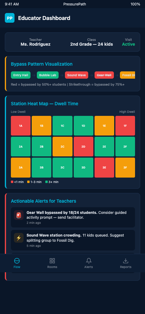
Layer 1: Floor-level pressure map. A heat map of the exhibit floor showing real-time and historical zone occupancy by group session. High-pressure zones are where the school wave concentrated; low-pressure zones are where it didn't flow. For a children's museum exhibit designer, the heat map immediately identifies whether your floor has stable bypass zones — areas that consistently receive low pressure regardless of group composition — or variable zones that respond differently to different group profiles.
PressurePath generates this map from sensor occupancy data, updating in real time during an active session and producing a session-average overlay for post-visit review. The pressurized-water framing makes the heat map legible to educators without statistical background: high-pressure zones are where the fluid burst went; low-pressure zones are where it didn't.
Layer 2: Station-level stop rate and dwell time. Per-station metrics for each group session: stop rate (percentage of group members who stopped for ≥15 seconds), average dwell time, and comparison to grade-level historical baseline. Traf-Sys people-counting analytics generate per-zone occupancy reports that form the raw input for this layer.
A station showing a stop rate of 11% against a third-grade baseline of 38% is flagged with a bypass alert. The alert includes the current session's group profile (grade, size, visit history) and the historical distribution — is this deviation typical for this group type, or is it unusual? That context determines whether the flag warrants a mid-session intervention or a post-session design review.
Layer 3: Cross-group pattern analysis. The bypass pattern view that docent instinct cannot produce. Across six Tuesday sessions, which stations showed consistent bypass (structural problem) and which showed variable bypass (group-specific or time-specific problem)? Visitor behavior analysis research (MDPI) identifies movement and engagement data as the most actionable signal for staff dashboards precisely because it distinguishes structural from situational patterns.
Cross-group pattern analysis produces the prioritized redesign list: structural bypass candidates (consistent low stop rate across all group types) are exhibit redesign priorities; situational bypass candidates (low stop rate for specific grade levels or arrival times) are calibration priorities.
Layer 4: Learning-goal linkage. The most important layer for grant accountability. Each station's bypass data is mapped to its associated learning objectives. A station with 9% stop rate and a stated NSF objective of "water cycle comprehension for grades 3-5" is an accountability red flag that the dashboard surfaces explicitly — not buried in aggregate attendance data.
Dexibit's purpose-built dashboards integrate footfall, heatmaps, and exhibit-level engagement into a single interface. An academic prototype from Jönköping University demonstrates a real-time dashboard that surfaces congestion and bypass as distinct signal types. PressurePath combines those capabilities with grade-level historical baselines specific to field trip contexts.
Advanced Dashboard Configurations
The first advanced layer is alert routing. Rather than a single dashboard that all staff check, route specific alert types to specific roles. A bypass alert for the Water Cycle puzzle routes to the floor docent covering that zone. A wave-pressure alert for the atrium entry routes to the front desk staff managing group check-in. A session summary report routes to the exhibit design team at end of day. Alert routing reduces the gap between when a bypass is detected and when the relevant person acts on it.
Wave-read detection for skipped stations builds the analytical foundation that the dashboard visualizes: the methodology for identifying which stations a wave skipped, and distinguishing that pattern from normal throughput variation, is what gives the dashboard alerts their precision.
The DataCalculus visitor survey strategies approach of combining survey and tracking data into exhibit-interpreter dashboards quantifying underperformance matches the Layer 4 learning-goal linkage architecture. Survey data provides qualitative context (what did kids think of the exhibit); tracking data provides behavioral evidence (what did kids actually do at the exhibit). Combined in a single dashboard view, they produce the evidence base for exhibit redesign decisions that neither source supports alone.
The second advanced layer is predictive alerts. Rather than waiting for a bypass to manifest in the current session's data, a predictive dashboard flags upcoming sessions likely to show bypass based on reservation profile matching. A 34-kid third-grade group booked for 10:15 AM Tuesday, from a district that has historically shown 85% bypass rate at the Water Cycle puzzle, gets a pre-session bypass risk flag. The floor team receives the flag at morning briefing and pre-positions a docent.
Station engagement tracking tools feed the raw data that makes predictive alerts possible — the tracking workflow is the input layer; the educator dashboard is the output layer.
For safety inspection flow data from haunted attraction contexts, the dashboard architecture is directly analogous: flow data collected for safety purposes is the same data that surfaces bypass and congestion patterns for design purposes. The instrumentation serves multiple purposes when the dashboard is designed to expose both.
Mobile Dashboard Delivery for Floor Teams
The educator dashboard is most effective when it reaches the people who can act on it — not just the design team reviewing data at the end of the week, but the floor staff working the Tuesday 10:15 AM slot. PressurePath delivers real-time alerts to mobile devices, giving the docent covering the Water Cycle zone a bypass alert on her tablet the moment the station's stop rate drops below threshold.
That mobile delivery changes the dashboard from a retrospective tool to a prospective one. Rather than reviewing bypass patterns after the fact and discussing responses in a planning meeting, floor staff receive actionable alerts during the session — with enough context (current stop rate, historical baseline, recommended intervention) to act immediately. The design team still gets the full analytical dashboard for retrospective review; the floor team gets the alert layer for real-time response.
Combining the two delivery modes — mobile alerts for real-time response, full dashboard for retrospective analysis — gives children's museum exhibit designers a complete picture: what happened today at each station, and what the pattern means across the season. Neither layer alone is sufficient. Together, they produce the evidence base that both floor operations and exhibit design decisions require.
Dashboard Maintenance and Baseline Calibration
A bypass detection dashboard is only as accurate as its baselines. If the grade-level stop rate baseline for third-graders at the Water Cycle puzzle was calculated from last spring's data, and this fall's third-grade cohort has a different demographic composition — more first-time visitors, different district mix, higher proportion of Title I schools with no prior STEM exposure — the fall alerts will be calibrated against the wrong baseline.
PressurePath updates grade-level baselines automatically as new session data accumulates, recalibrating the "expected stop rate" for each station-grade combination after each field trip season. The recalibration is conservative: it requires a minimum sample size before updating a baseline, so a single unusual session doesn't skew the comparison point. A baseline built from 200 third-grade sessions is substantially more reliable than one built from 20, and the dashboard reflects that confidence interval.
For children's museums that operate in seasonal cycles — heavy fall and spring, lighter summer — the baseline calibration workflow aligns with the school calendar. Fall data recalibrates the spring baseline; spring data recalibrates the fall baseline. The dashboard is always comparing current sessions against the most recent comparable season, not against a two-year-old average.
Build the Dashboard Before the Redesign Meeting
Children's museum exhibit designers who schedule quarterly exhibit design reviews typically walk into those meetings with attendance summaries and docent impressions. The structural bypass patterns that should drive redesign priorities are not in those summaries. They're in the per-station tracking data — if it's been collected and visualized correctly.
The timing asymmetry matters. Dashboards built after a redesign decision are documentation; dashboards built before a redesign decision are evidence. The first supports an already-made case; the second determines which case gets made in the first place. For quarterly design reviews, the dashboard needs to exist and be calibrated at least six weeks before the meeting, so that the bypass patterns have time to surface as reliable signals rather than single-session noise. Museums that build the dashboard in response to a design question discover that they don't yet have the data density to answer it.
The preparation discipline also matters for grant cycles. NSF and IMLS reporting windows typically require engagement evidence from the prior school season, and a dashboard launched in the same quarter as the report is due cannot produce that evidence. The design and reporting calendars both push the same conclusion: dashboard infrastructure has to precede the decisions it's meant to inform, often by a full academic year. The museums that build it early have the data ready when the decisions arrive; the museums that build it late are still collecting baseline data when the redesign meeting starts.
PressurePath gives educators a dashboard that makes bypass patterns visible at the design meeting level: stop rates by station, grade-level comparisons, structural versus situational bypass distinctions, and learning-goal accountability links. If you're preparing for a grant renewal or exhibit redesign cycle and want bypass data rather than attendance summaries, join the PressurePath waitlist for children's museum educators and exhibit designers.