Workflow Tools for Tracking Station Engagement During Field Trips
What "They Seemed Engaged" Actually Costs You
The 10:30 AM group from Jefferson Elementary fills out your post-visit survey with mostly high ratings. The chaperone tells the docent they "really loved the science section." Back in your design review meeting, someone quotes that feedback as evidence the Water Cycle puzzle is working. What no one mentions: 22 of the 29 kids walked past the puzzle without stopping. The three who did stop averaged 40 seconds. The two remaining kids pulled a lever and immediately left when nothing dramatic happened.
Docent impressions of field trip engagement are structurally incomplete. A docent stationed near the atrium entrance can observe the arriving wave and form an impression of energy and movement. What she cannot do is simultaneously monitor stop frequency at the Water Cycle puzzle, the Erosion table, the Atmosphere pressure column, and the Circuits station while also managing student questions and chaperone logistics. The gaps in direct observation are not a staffing failure — they're a geometry problem.
Research on children's STEM museum engagement documents that children average roughly one minute per interactive exhibit with high station-to-station variability — meaning some stations hold kids for three minutes and others get ten-second pass-throughs. Without systematic per-station tracking, those differences are invisible in aggregate satisfaction ratings.
Museum visitor studies confirm the measurement problem: Visitor Studies tracking methodology research establishes that meaningful engagement data requires following visitors and recording actual stop locations and dwell times — not relying on perimeter observation or exit surveys.
The consequences for exhibit design are direct. A team that evaluates exhibits based on satisfaction surveys and docent impressions will misidentify the Water Cycle puzzle as a mid-tier performer — getting some positive feedback, some neutral — when the tracking data would show a 14% stop rate. The team invests in programming and facilitation at that station rather than redesigning the approach corridor or adjusting the lever mechanism's visibility. The bypass continues through the next 40 field trip days because the measurement gap prevented the right diagnosis.
Building a Station-Level Tracking Workflow
The pressurized-water metaphor clarifies what you're measuring. A 30-kid school wave enters your museum as a high-pressure fluid burst. Each station is a pressure valve — it either captures some of the flow (dwell time, stop frequency) or lets the burst continue unimpeded (bypass). A tracking workflow that only measures total throughput tells you nothing about which pressure valves are working and which are acting like open pipes.
Station-level tracking requires instrumentation at the exhibit layer, not just the entry/exit layer. The three practical options for children's museum field trip contexts are RFID badge systems, passive sensor arrays, and structured observation protocols.
RFID badge tracking, documented in the Exploratorium's implementation study (CACM), achieves near-human accuracy in recording station stops and dwell times without requiring any behavior change from visitors. Kids carry a badge clipped to a lanyard — a format that works naturally in field trip contexts where name tags are already common. Each station antenna logs a stop when a badge dwells within range for a configurable minimum time (typically 15-20 seconds), which filters incidental pass-throughs from intentional engagement stops.
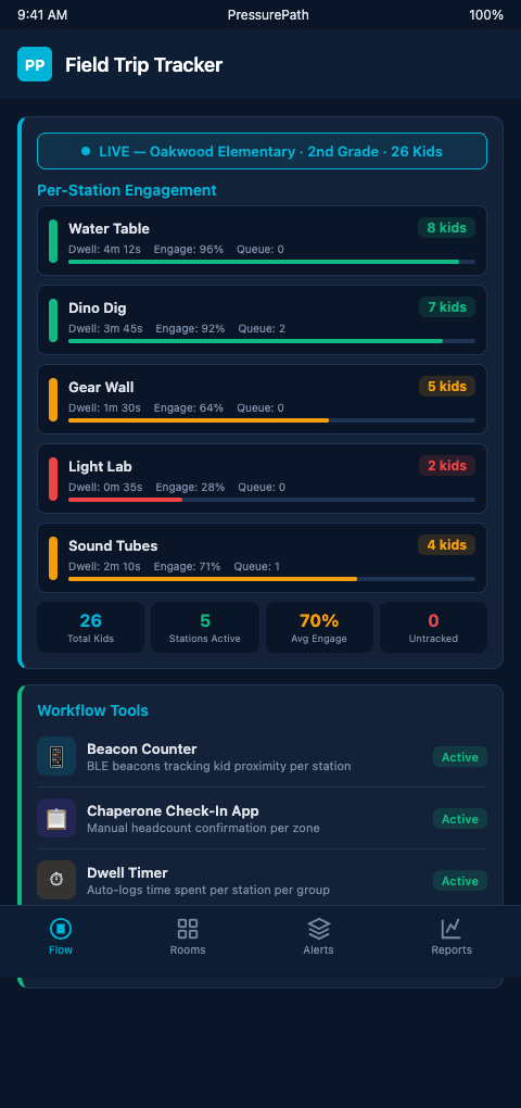
PressurePath ingests RFID badge data as a real-time feed, translating each station's stop-rate and dwell-time stream into pressure readings on the flow map. A station showing 8% stop rate from the current group, against a historical baseline of 34% for third-grade cohorts, flags as a low-pressure node — a bypass alert rather than a success signal.
Passive sensor arrays — infrared counters or camera-based people-counting systems — provide zone-level occupancy data without requiring any visitor instrumentation. Xovis sensor systems reconstruct visitor trajectories room-by-room from sensor data. Zone occupancy is less granular than individual stop data, but for children's museum exhibit designers working at scale, it produces a continuous floor-pressure map: which zones are drawing the wave, which zones are being bypassed, and how that pattern shifts as the group disperses from the initial atrium compression.
Structured observation protocols are the lowest-cost option. A trained observer with a tablet and a standardized stop-recording form can track one exhibit cluster during a field trip session. The visitor behavior methodology research in Visitor Studies provides the foundational framework: record each visitor or sub-group as they approach, note whether they stop (dwell ≥15 seconds), record dwell time, and mark whether they engaged with the interactive mechanism. For a two-observer team covering eight stations, one observation session per school group generates enough data to calculate stop rates and average dwell times by station.
The limitation of structured observation is sample rate — you can cover eight stations with two observers during one group's visit, but not all 14 stations simultaneously across five groups per day. Sensor-based systems operate continuously without staffing constraints. For exhibit designers making budget decisions, the practical path is hybrid: sensor arrays for perimeter and high-traffic zone coverage, structured observation for targeted deep-dives on specific stations under evaluation.
Dexibit's visitor dashboards integrate multiple data streams — footfall sensors, badge data, zone occupancy — into prebuilt heatmaps that surface station-level engagement patterns. For educator dashboards that surface bypass patterns, the tracking workflow feeds these visualization layers: raw dwell-time data becomes bypass flags, bypass flags become dashboard alerts, dashboard alerts become floor team actions.
Advanced Tracking Configurations for High-Volume Field Trip Days
On a day with six consecutive school groups, individual group tracking produces a matrix: each of the 14 stations gets six stop-rate readings and six average dwell-time readings. The matrix immediately surfaces which stations are consistently bypassed across all groups (structural bypass — the station itself is the problem) versus stations bypassed by specific group profiles (conditional bypass — the station works for some kid demographics but not others).
NSF-funded research on visitor engagement at interactive science stations documents engagement depth variation across different visitor types — a finding directly applicable to cross-group station tracking. A bypass pattern that holds across all six Tuesday groups is a redesign signal. A bypass pattern that appears only in the third-grade groups and not the fifth-grade groups is a content-calibration signal.
The advanced configuration that most directly improves exhibit design decisions is linking tracking data to reservation intake fields. When the tracking system logs that Group 3 (34 third-graders, Jefferson Elementary) showed 9% stop rate at the Water Cycle puzzle, and the reservation record notes this was a Title I school with no prior STEM museum visit, that combined record becomes a learning-goal leak signal. The pacing simulators vs docent instinct comparison shows why: docent observation would have registered "third-graders moved quickly through that section" — indistinguishable, in real time, from whether the speed reflected enthusiasm or bypass. The tracking data disambiguates.
For museums using scene density tracking tools from immersive theater contexts, the methodology translates directly: tracking audience density by zone during a performance maps to tracking group density by exhibit zone during a field trip. Both applications identify where the wave concentrates and where it thins out — the engagement signal is in that distribution, not in aggregate throughput.
The final advanced configuration is real-time alert thresholds. Rather than reviewing tracking data in post-visit reports, set a station bypass alert for dwell rates that drop below a floor threshold (e.g., stop rate below 20% for any 15-minute window during a field trip session). PressurePath surfaces those alerts to the floor team's mobile dashboard in real time, enabling mid-visit intervention — a docent repositioning, a chaperone cue — rather than a post-visit redesign discussion.
Connecting Tracking Data to Design Decisions
The practical value of station-level tracking materializes at the design review meeting. When exhibit designers gather to evaluate which stations need renovation, updated signage, or repositioning, the conversation typically relies on staff impressions and aggregate attendance figures. Station-level tracking replaces those inputs with a ranked list: station A has an 11% stop rate against a 38% baseline; station B has a 44% stop rate against the same baseline. Station A is the redesign priority, with a quantified deficit that justifies the investment.
That quantified baseline is what grant reporting increasingly requires. IMLS-funded exhibits are evaluated on measurable learning outcomes — and a station that generates a 9% stop rate across 200 field trip sessions is not meeting its outcome targets regardless of how positively visitors rate the museum overall. Tracking data at the station level produces the evidence that makes those determinations possible, rather than leaving them to judgment or anecdote.
Analyzing visitor behavior research (MDPI) confirms that Interactive Engagement and Movement Patterns account for the dominant share of visitor behavior study findings — meaning the research community has already established that station-level behavioral data is the most informative signal for exhibit effectiveness. The tracking tools that produce that data are now accessible to children's museums at implementation costs that weren't realistic a decade ago.
Track Once, Learn Continuously
Children's museum exhibit designers who implement station-level tracking for field trips consistently report the same discovery: their intuitions about which exhibits work were right about the popular stations and wrong about the marginal ones. The popular stations were visibly popular — no tracking required. The marginal stations — the ones where bypass happened quickly and quietly — were the ones where tracking data changed the design conversation.
The continuous-learning aspect of station tracking matters because exhibit effectiveness is not a fixed property. A station that holds third-graders reliably in October may show declining stop rates by March as the novelty effect wears off for repeat-visitor districts. A station that underperforms for second-graders may work well for fifth-graders. Those variations are invisible in cross-sectional snapshots but become the core operational signal in longitudinal tracking. Each field trip visit adds a data point that refines the baseline, tightens the confidence interval on each station's expected performance, and surfaces emerging deviations before they become entrenched patterns.
The measurement discipline also changes the exhibit team's internal conversations. Rather than debating whether the Water Cycle puzzle "feels" underperforming, the team has a specific number — 14% stop rate against a 38% baseline — that anchors decisions in data rather than impressions. That anchor makes it easier to justify targeted interventions to skeptical board members, grant evaluators, and fabrication partners who need evidence before committing resources to a redesign or reposition.
PressurePath gives exhibit designers a persistent tracking baseline that accumulates across every field trip day, turning each school wave into a data point that sharpens the flow model. If you design interactive exhibits for school groups and want to know which stations are working at the station level, join the waitlist for PressurePath and see how your current engagement data maps to bypass patterns.