Building Your First Flow Map for a Children's Museum Floor
What a Flow Map Is (and Isn't)
A Tuesday morning in October. P.S. 142's third-grade class is 45 minutes into their visit, and the floor coordinator has a mental model of where the group should be. The group is not there. They're clustered near the construction zone exhibit in the east wing, having bypassed the astronomy gallery entirely on their way across the floor.
The coordinator's mental model was a floor plan—a physical layout with stations labeled. It was not a flow map. A floor plan shows where things are. A flow map shows where groups go. It encodes movement pressure, bypass paths, deceleration zones, and decision nodes. Those are different documents, and most children's museums only have the first one.
The floor plan is static. The flow map is dynamic—it changes with wave density, entry timing, chaperone behavior, and the magnetic properties of individual exhibits. A flow map built for a 30-kid third-grade wave looks different from one built for a 15-kid first-grade group, even in the same floor plan. Getting the unit of analysis right is the first step: the flow map should be built for the specific wave conditions your museum actually receives, not for an average visitor.
Building your first flow map is the step that converts your floor plan from a design document into a diagnostic tool for school-wave bypass. It doesn't require expensive software or a consultant. It requires observation, a framework for what to observe, and a method for converting observations into pressure indicators.
The Data Inputs for a Children's Museum Flow Map
A functional flow map for school-group field trips requires three data types: observed movement paths, dwell time per station, and entry/exit timing. Collecting all three during actual field trip days is achievable with a combination of people counters, staff observation logs, and video review.
Tracking and timing research at the Children's Museum of Manhattan established that family dynamics in children's museums mask bypass patterns in ways that individual visitor tracking doesn't reveal. A flow map built only on individual movement data misses the group-wave mechanics that drive school bypass. The unit of analysis has to be the wave—entry as a group, movement as a group, bypass as a group event.
ASTC's annual statistics survey puts U.S. school visits at 13 million annually, which means at scale, accurate first flow maps are essential for coordinating the volume of field trip traffic that any mid-size museum receives in a season. Even a single accurate flow map from one field trip day provides enough data to identify the top two or three structural bypass points in a floor plan. Start with one day. Observe one wave. That data is more actionable than a year of post-visit surveys.
Pedestrian simulation validated as a primary method for analyzing museum circulation shows that simulation-based flow analysis is reproducible and scalable—you don't have to observe every field trip day to build an accurate pressure model. A calibrated simulation run against your floor plan geometry produces a pressure map that identifies bypass risk across all expected wave conditions. The first observation day provides the calibration data; the simulation extends that data across all wave scenarios.
Visitor path choice and wayfinding research documents that a century of research points to layout, visibility, exits, and signage as the primary drivers of path choice in museum spaces. That finding, applied to 30-kid waves, means your flow map needs to encode visibility corridors (what can each wave position see from where it's standing), exit signals (which way does each zone feel like "forward"), and signage effects (where text-based wayfinding slows or channels the wave).
Building the Map: Five Steps
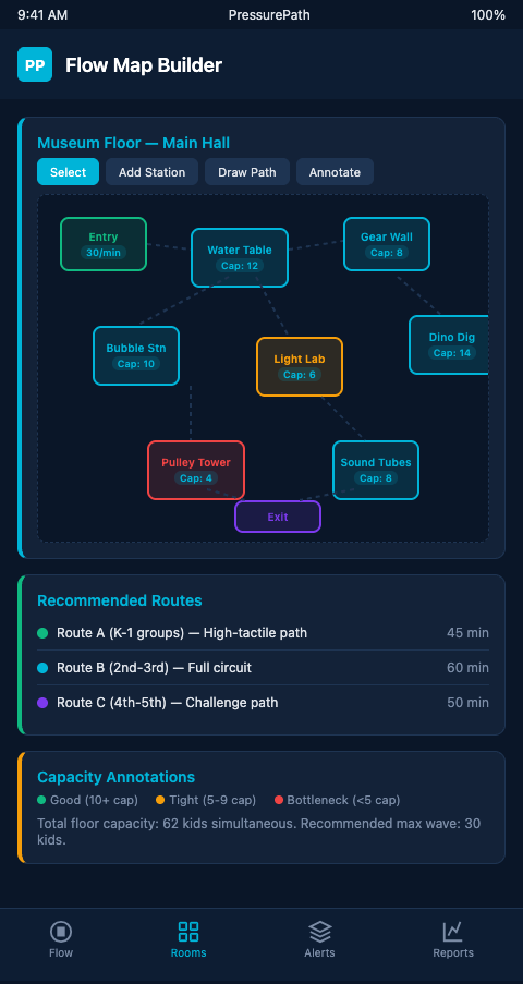
Step 1: Mark entry and exit vectors. Start with your floor plan and draw lines showing where the P.S. 142 wave enters (main atrium), where it exits (cafeteria or gift shop), and what structural elements sit between those two points. These vectors define the primary flow corridor—the path of least resistance through your floor. Every station not directly on that corridor starts the day with elevated bypass risk. If you want a reference for this step-by-step pressure mapping approach applied to a different venue type, the first haunt flow model walks through an analogous room-by-room process, and several of the room-transition pressure concepts translate directly to exhibit-zone transitions in a children's museum floor.
Step 2: Identify natural deceleration zones. These are the points in your floor plan where the wave naturally slows: corners, narrowings, exhibit clusters with high early-engagement energy, zones with ceiling or lighting changes. Mark these as potential capture points. A station positioned at a natural deceleration zone has a dramatically higher capture rate than one positioned mid-corridor with open bypass lanes on both sides.
Step 3: Score each station for bypass risk. Using Serrell's SRI framework as a reference, score each station on two dimensions: its position relative to the primary flow corridor (central vs. off-axis) and its affordance visibility from 20+ feet. A station that is off-axis and invisible from distance scores high bypass risk. A station that is on-axis with visible affordances scores low bypass risk. High-bypass stations that carry critical educational goals are your primary intervention targets.
Step 4: Map observed dwell time against station position. After a field trip day, collect dwell time data per station from people counter logs or staff observation notes. Overlay that data on your floor plan. The pattern will show concentration at two or three stations and near-zero contact at several others. That zero-contact cluster is your bypass shadow—the geographic region of your floor plan where wave momentum is consistently too high for stops to occur.
Step 5: Model intervention points. For each high-bypass station, identify the minimum upstream change that would redirect wave pressure toward it. Visitor journey mapping methodology captures touchpoints and decision nodes—apply that framework to the specific point in the flow map where the wave diverges from the critical station's entry path. At that divergence point, a rope partition, chaperone position, or signal element can redirect the wave without changing any exhibit's design.
Using the Map to Prioritize Interventions
A completed flow map produces a ranked list of bypass risk points. For most children's museum floors, the top three are: a mid-floor science exhibit with low affordance visibility, an off-axis reading or quiet activity zone that the wave flows around, and a near-exit station that gets bypassed as chaperones begin exit count.
PressurePath converts your first flow map into a pressure simulation—treating the wave as high-pressure fluid and modeling how changes to partitions, station placement, and chaperone scripting alter the flow path through your floor. The simulation is calibrated to your specific floor geometry and the wave densities your museum actually receives.
The flow map also reveals time distribution patterns that post-visit surveys miss. A wave that enters at 10:15 AM typically exhausts its highest-energy engagement in the first 20–25 minutes. By 10:40, the wave has often settled into exit-mode behavior—chaperones are steering toward the gift shop, and children are following. Stations that are positioned beyond the 25-minute reach from entry receive the wave in exit mode, which means much lower dwell times even at stations with strong magnet properties.
Understanding the time distribution changes how you sequence the floor plan's educational content. The highest-priority learning exhibits—the ones your grant evaluations depend on—should be positioned within the 20-minute high-energy zone, not at the end of the suggested tour route where exit-mode dynamics have already taken over.
The relationship between your floor's physical geometry and its bypass risk is the foundation of exhibit footprint bypass risk, which covers how station dimensions and placement interact with wave pressure in ways that the flow map makes visible. For the longer audit process of a full field trip day, field trip day learning leaks extends the flow map framework into a complete diagnostic cycle.
Building a first flow map often reveals that the bypass problem is smaller than expected—usually two or three structural changes, not a full renovation.
The First Flow Map Is a Starting Point, Not a Solution
A flow map doesn't fix bypass. It makes bypass visible and quantifiable. The value of building your first one is that it converts an intuition—"I think the wave skips the Water Cycle puzzle"—into a quantified pressure analysis: "The wave bypasses the Water Cycle puzzle in 87% of school group visits because it sits off the primary flow corridor with no visible affordance from the main circulation path, and the leading edge makes the bypass decision 12 feet before reaching the station entry."
That quantification is what grant evaluators and education directors need to see before approving physical changes to the floor. It's also what chaperone briefing materials need to direct adults to the right positions before the wave arrives. A flow map doesn't just support renovation—it supports the operational decisions that can improve bypass rates on the next field trip day without changing a single exhibit.
Children's museum exhibit designers building or revising their floor plan are the exact audience for PressurePath's early access program. Join the waitlist to run your first flow map simulation and see where your school waves actually go.