The Greenest Offshore Wind Gardens by Operator
Why the League Table Has Been Broken
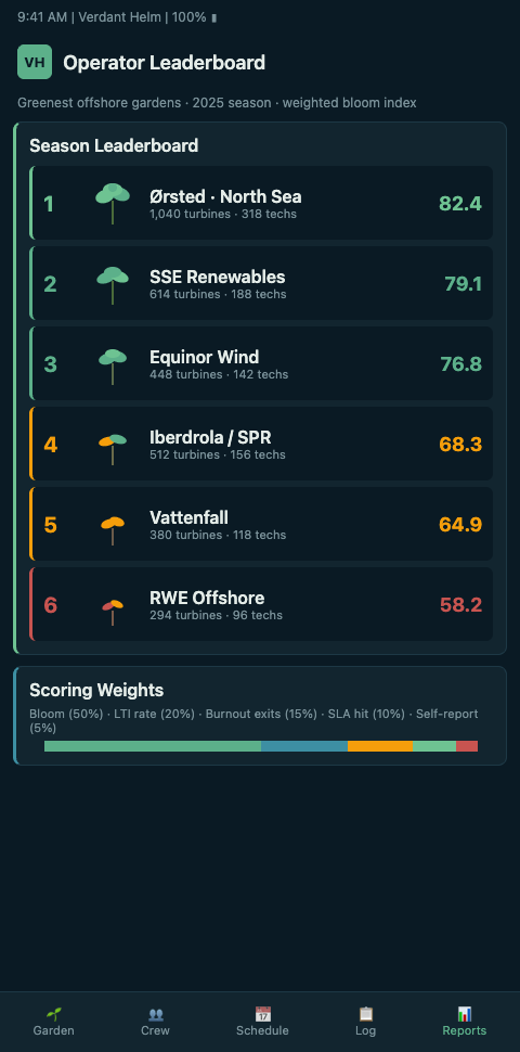
An investor, a journalist, or a regulator asking "who runs the greenest offshore wind operation" gets three different answers depending on which benchmark they read. The GWEC Global Wind Report 2024 shows 94% of new 2024 capacity from five nations and ranks operators by capacity and build pipeline. The TGS 4C Offshore global wind farms database catalogues 2000+ OWFs across 53 countries with owner stakes and turbine counts — a volume ranking. Ørsted's own sustainability reporting cites eight consecutive years at the top of Corporate Knights Global 100 and an MSCI AAA rating, and the Science Based Targets Initiative recognised Ørsted as the first energy major to complete a green transition. Ørsted ranks highly by each of those lenses. Morningstar's coverage of UK AR7 notes Ørsted won zero of the 8.4 GW awarded, with RWE taking 6.9 GW and SSE taking 1.4 GW. The operator league reshuffles by the quarter.
None of these benchmarks measure crew-garden health. That is the missing scorecard. WindEurope's 2024 statistics and outlook pegs Europe at 37 GW installed offshore, and the operator-by-operator capacity view is now dense enough that a green-garden scorecard becomes meaningful rather than anecdotal. Ørsted's 10.2 GW installed position sits at the top of the capacity view but tells you nothing about the burnout rate of the crews maintaining it.
The capacity-ranking dominance has had unintended consequences. Operators measured primarily on installed capacity and pipeline have invested disproportionately in headline build-out and under-invested in the operational infrastructure that sustains that capacity safely across a 25-year asset life. The result is a sector where several of the largest operators carry the highest absolute incident counts while sitting at the top of capacity rankings — a contradiction that capacity-only benchmarking obscures and that the investing public does not see. A workable operator scorecard has to correct for this without discounting the structural value of scale.
What a Garden-Health Scorecard Actually Measures
Treat the sector as a regional garden with operators as plot owners. A fair comparison across Ørsted's ten-gigawatt portfolio, Vattenfall's multi-country presence, RWE's AR7 surge, SSE's North Sea concentration, and Equinor's floating-wind lead requires normalising by asset count, geography, and reporting discipline. Verdant Helm's operator scorecard shape has four axes: bloom-state density (what fraction of the roster sits in bloom versus wilt across the 14-day forecast), recovery-ledger discipline (are off-rotation credits actually earned or paper-only), prune-event rate (how often does the garden protect a tech by pulling them from a climb), and reporting completeness (the share of the fleet that feeds continuous signal rather than quarterly reconstruction).
The scorecard differentiates operators along lines that capacity rankings miss. An operator with 10 GW installed and a reporting-completeness score of 40% ranks lower on garden health than an operator with 3 GW installed and 90% completeness. That is the honest comparison, and it changes the incentive. Operators that stand up continuous telemetry earn a higher scorecard position; operators that treat the crew-energy layer as ornament stay lower regardless of how many ribbons they cut.
The scorecard also creates structural pressure on the tail. Mid-size operators with single-digit gigawatt portfolios often lack the IT investment thesis for a continuous-telemetry rollout, and under capacity-only rankings they remain invisible on crew-health axes. A published scorecard gives those operators a specific investment target: move reporting completeness from 20% to 50% in twelve months and the scorecard position improves measurably even without any capacity change. This is the kind of tactical opening that accelerates sector-wide telemetry adoption — the small operator's path to a visible scorecard position is cheaper than the large operator's, and the first few to close the gap publicly demonstrate the path for peers.
Geography matters. A North Sea-heavy portfolio experiences more weather-window intensity per megawatt than a Baltic portfolio, and a floating-wind operator experiences more motion-intensity baseline than a fixed-bottom one. The scorecard weights the four axes against a geography-adjusted expected intensity envelope, so an operator is measured against the conditions their fleet actually faces. Vattenfall's digital-twin programme is one example of the operational infrastructure the scorecard rewards — digital twins let the crew-energy layer attach to platform state and produce comparable bloom-adjusted availability across operators.
The scorecard's utility for investors, regulators, and customers matters too. Institutional investors scrutinising sustainability-labeled bonds need a defensible way to distinguish operators whose garden-health backs the label from those whose green credentials stop at generation capacity. Regulators overseeing workforce welfare need a benchmark they can cite when reviewing licence conditions. Major offtake customers negotiating long-term PPAs with sustainability clauses need a scorecard that discriminates within the "all offshore wind is green" blanket. Each of these audiences reads the scorecard differently, and the four-axis design supports all three reading modes without forcing a single ranking.
What emerges is not a single leaderboard but a scorecard with operator strengths and shortfalls made visible. Ørsted might lead on reporting discipline. RWE might lead on bloom-state density as its AR7 fleet scales. SSE, with the Dogger Bank three-phase build-out reshaping its operating portfolio, might show the strongest year-over-year trend. Vattenfall might lead on digital-twin integration. The scorecard's value is diagnostic, not competitive — each operator reads their own axis first, and the sector gets a shared picture.
The per-axis view also exposes the compounding dynamics the sector has been missing. An operator with strong bloom-state density but weak reporting completeness is measuring crew health well on the fraction of the fleet it monitors and guessing on the rest. An operator with strong reporting completeness but weak recovery-ledger discipline is capturing data but not acting on it. An operator with strong prune-event rate but weak bloom-state density is over-pruning the small cohort it sees and under-pruning the rest. Each combination produces a different strategic priority, and the scorecard turns that into a concrete investment conversation instead of a generic "we need to do more on safety" statement.
Advanced Tactics
Three structural choices decide whether an operator scorecard is read as signal or dismissed as noise.
First, publish methodology before results. The first credible garden-health scorecard will win adoption by being transparent about every weighting, every normalisation, and every data source. Ørsted-style sustainability reporting already trains the market to distrust scores without methodology. Verdant Helm's scorecard ships with its weighting open, and opcos contributing data know exactly how their axes are computed. Opaque league tables get cited once and ignored.
Second, include absence as a signal. Operators that do not feed continuous data are not scored higher by default; they appear on the scorecard with an "insufficient data" flag that is visible to the reader. This creates the incentive structure that moves the sector forward — an operator with capacity but no garden feed knows their scorecard position is capped until the feed exists, which changes the internal conversation about crew-telemetry investment.
Third, refresh on a meaningful cadence. Quarterly is too fast for a structural scorecard; annual is too slow for an operational one. Verdant Helm publishes the scorecard on a rolling 12-month window with a refreshed snapshot every quarter, matching the rhythm of the G+ Annual Report while giving operators a mid-year read that reflects active improvements. Getting the cadence right is how the scorecard stays relevant past the first publication cycle.
Fourth, publish the axis definitions as an open specification. The scorecard earns industry legitimacy only if its weightings and normalisations are inspectable. Every opco with a scorecard position should be able to reconstruct the calculation from published specification and their own raw data, and third-party reviewers should be able to audit the same. This is the distinction between a scorecard that journalists cite and one they dismiss.
Fifth, track the scorecard's own predictive accuracy. An operator with a strong scorecard position should, over time, produce better G+ safety outcomes, lower insurance premia, and tighter O&M contract terms. If the scorecard does not predict those downstream outcomes, the methodology needs revision. Verdant Helm publishes annual backtesting of the scorecard against operator-level outcome data, and revisions to the weighting are documented against the backtest evidence rather than adjusted by editorial judgment.
The operator scorecard sits inside a larger data ecosystem. Pushing garden telemetry to 450 offshore turbines describes the fleet-scale rollout that makes high reporting-completeness scores achievable. A burnout-free CTV season is the single-asset proof that feeds the multi-asset scorecard. For the cargo-fleet parallel, VLCC and ULCC operators ranked by garden data maps the same scorecard logic to deep-sea tonnage and confirms the methodology holds across maritime sectors.
Read Your Operator's Scorecard Position This Month
Offshore Wind Ops leaders at the ops-committee level should book a scorecard review and pull their own position against the four axes before the next investor call or sustainability filing. Verdant Helm's operator view assembles bloom-state density, recovery-ledger discipline, prune-event rate, and reporting completeness from continuous data across the portfolio and ranks the result against sector benchmarks. The axis with the weakest reading is the investment case for the next quarter's crew-telemetry upgrade — and the one that shifts the scorecard position fastest on the next publication.
Run the internal read before the external publication catches up. The first published industry scorecard will crystallise operator positions that were previously ambiguous, and operators that have spent a quarter reading their own scorecard privately will know where they stand before the investor call rather than learning from the news. Internal reads also let the operator correct for data-collection gaps they can fix before publication — a misconfigured telemetry feed on one SOV, a schema mismatch on a legacy SCADA integration, a missing near-miss log cycle from a phase lead who changed roles mid-quarter. Catching these internally changes a weak axis from a structural shortfall to a fixable reporting artifact.
Budget for two consecutive quarters of improvement on the weakest axis before the next scorecard publication. The axis that starts at the weakest position is typically the one where the fastest gains are available, and two quarters of focused investment — continuous-feed rollout on one more phase, a Friday review discipline across the HSE function, a revised recovery-ledger protocol that stops resetting at shift end — usually produces a measurable axis shift. The investor narrative that emerges from "weakest axis moved from below sector median to sector median across two quarters" is more credible than a general claim of improvement, because the scorecard's methodology is published and the axis movement is auditable. That defensible narrative is the commercial return on the scorecard rollout, and it compounds every subsequent quarter the operator stays engaged with the benchmark.