How to Read Salt Spray Deposition Patterns in Coastal Citrus Groves
Why Salt Spray Deposition Is Not Uniform Across a Grove
Most coastal growers still treat salt exposure as a single-number risk — "we're 1.2 miles from the water, we lose 15% in a blow." The published physics say otherwise. A 2020 review in Estuaries and Coasts found salt spray distribution varies with wave energy, wind speed and direction, distance from shore, topography, and the plant architecture of the canopy itself (Springer: Salt Spray Distribution and Vegetation Zonation Review). A coastal LES study measured sea-salt concentrations decaying to roughly 20% of coastal levels at 50 km inland — a power-law falloff, not a linear one (ScienceDirect: Sea salt aerosol deposition coastal zone LES study).
For citrus specifically, UF/IFAS field guidance documents how salt stress cuts root growth, flowering, and leaf size — and emphasizes that citrus has only low-to-moderate salt tolerance to begin with (UF/IFAS Extension St. Lucie County). Add Florida's canker vulnerability and salt-damaged leaf cuticles and you get a compounding problem — the outer Hamlin rows aren't just wind-scorched, they're prepped for infection.
The economic consequence stacks on the agronomic one. A Valencia block that would have priced at juice-plant premium tier loses 40% of its brix value after a moderately severe onshore event goes unread. A Murcott block targeted at 80-count cartons slips into 125-count cartons when salt stress interrupts fruit sizing. Two blocks in the same grove, hit by the same aerosol load, can book completely different revenue — and the variable that separates them is almost always whether the grove read the deposition gradient before the event, during the event, or too late.
Reading Deposition Gradients With a Helm-Charted Yield Forecast
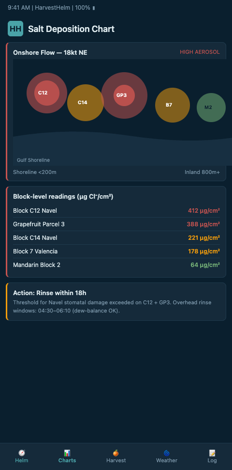
HarvestHelm treats a grove the way a yacht captain reads chop: you don't look at the average of the water, you look at where each wave is coming from. The helm-charted yield forecast overlays salt deposition vectors on block maps so each Valencia, Hamlin, or Murcott row gets its own predicted chloride load per onshore event. The nautical dashboard doesn't hide the chart underneath a single "coastal risk" gauge — captains steering the yacht helm through micro-climate threats see individual block exposure tracks.
The core signal HarvestHelm pulls is wind speed crossing the 3.0 m/s critical threshold. Brazilian coastal measurements found marine salt deposition is strongly influenced by onshore winds above that speed (ScienceDirect: Measurements and modelling of marine salt transportation Brazil). Below 3.0 m/s, aerosol drops out fast. Above it, chloride rides inland — and the falloff curve shifts. A grove dashboard that doesn't resolve wind speed at the block level can't distinguish a 2.8 m/s day from a 4.1 m/s day, and those two days produce completely different salt loads on the same row.
Three inputs drive the chart:
- Distance-from-shore decay — plotted as a power-law curve per block centroid, not a linear one.
- Wind vector and speed history — 48-hour rolling at the block level, with the 3.0 m/s threshold marked as an alert band.
- Canopy architecture offset — dense Hamlin canopies strip more aerosol than open-planted Murcott, so the leading edge takes the heavier load.
IoT sensor networks give the dashboard its data layer. A 2025 Frontiers review on IoT precision agriculture documented how distributed temperature, humidity, and wind nodes feed microclimate models accurate enough to drive salt-risk forecasts (Frontiers: IoT precision agriculture smart sensors). An LSTM-based citrus orchard deployment published in MDPI showed you can predict soil moisture and electrical conductivity with practical accuracy, and EC is the downstream signal that confirms the aerosol model (MDPI: IoT soil moisture and EC prediction citrus orchards).
The HarvestHelm helm chart uses those sensors as the keel sensors — telling the captain whether the forecast trajectory is holding up against ground truth.
The chart is built for a specific workflow. A grower arrives at the dashboard first thing in the morning, and the helm chart shows three things in the top band: current wind vector, rolling 48-hour aerosol-risk score per block, and any blocks whose sensor readings are diverging from model predictions. The divergence flag is the captain's cue to walk the block — not to retune the model. When a sensor disagrees with the forecast, the sensor usually tells the truer story. HarvestHelm's UX discipline keeps that signal on the surface, not buried three clicks deep.
For a grove with 12 blocks across a mile of Indian River frontage, the typical chart reads something like this: three first-line Hamlin blocks sit at elevated aerosol-risk with EC slowly climbing; two mid-grove Valencia blocks are holding steady; two interior Murcott blocks are sheltered but showing unexpected EC drift because canal water is carrying upstream salt. The captain steers three different responses — flush the first-line blocks, hold the Valencia, investigate the canal. Without the block-level chart, all three get treated as a single grove-wide problem and two of them get handled wrong.
The sensor-ground-truth loop is what makes the chart durable. Model-only forecasts drift. Sensor-only readings are retrospective. HarvestHelm's helm chart couples them on a short cycle — the chart shows the 72-hour forecast at the top and then overlays the last 24 hours of sensor readings below, with the delta color-coded to highlight divergence. When the sensor says EC is climbing faster than the model projected, the chart flags the discrepancy and nudges the captain to walk the block. When the model projects a rising aerosol event that sensors haven't yet confirmed, the chart holds the alert in a pre-triggered state so the captain can pre-stage flush before the event actually lands. That loop — forecast forward, ground-truth backward, reconcile at the chart — is the navigation discipline that separates operational helm charting from static risk modeling.
Advanced Tactics: Canopy Gradient Sampling and Edge-Case Events
The mistake growers make when they first start mapping is placing sensors at the canopy tops. Canopy tops take the aerosol hit first but drain faster — sheltered interior rows accumulate chloride slower but keep it longer. The correct sampling is a vertical column per row: three nodes at top, mid, and lower-interior, with soil-EC probes co-located below. That resolves the leaf-tip burn progression before the visible symptom window. For the field-reference of what those symptoms look like, pair the mockup with the salt ingress signals your trees will show before leaf drop.
Edge cases that routinely trip up growers:
- Offshore winds after a salt deposition event. The aerosol has already landed. Leaves look clean because the spray stopped, but EC is climbing at the root zone. Don't release the alert state based on wind direction alone.
- Canker pressure after a prolonged salt event. Damaged cuticles invite wind-driven rain infection. Score canker risk alongside salt risk, not separately.
- Rootstock-dependent thresholds. Carrizo and Cleopatra accept chloride at very different rates, so the tolerance inflection point is a scion-rootstock combination answer, not a grove-wide constant.
Rootstock-specific decisioning changes the chart itself. HarvestHelm reads the rootstock salt thresholds table against each block's scion-rootstock combination and applies the inflection number that matches the actual tree, not the grove average. Without that rootstock-aware lookup, captains end up flushing Carrizo blocks that still have headroom while Cleopatra blocks quietly cross their lower threshold unnoticed.
HarvestHelm's approach borrows from how mountain orchard operators resolve thermal microclimates — the same sensor-density philosophy that drives accurate frost pocket mapping across cold-air drainage zones. The physics differ; the sampling logic carries over.
Scaling the approach to multi-parcel operations is its own discipline. A grove with parcels in both St. Lucie and Martin County faces distinct onshore wind regimes, different bathymetry-driven aerosol profiles, and sometimes different rootstock histories per parcel. HarvestHelm handles the multi-parcel case by keeping each parcel as its own chart lane with parcel-to-parcel comparability — the captain can see which parcel carries the worst aerosol exposure per onshore event and allocate mitigation budget accordingly. The chart is parcel-native rather than a stitched-together county overlay.
One more tactic worth explicit mention: calibrating deposition forecasts against packinghouse size-curve preview data. When the size curve shows a surprise shift toward smaller fruit — 125-count carton volumes climbing while 80-count volumes drop — the underlying cause is often moderate salt stress that hasn't yet produced visible canopy symptoms. Running the size-curve preview against the deposition chart lets the captain spot stress earlier than canopy monitoring alone would reveal. Growers who couple the two data streams report catching stress events 7-10 days before visual symptoms show.
Brokers and juice plants are learning to ask for the deposition-chart data directly. A grove that can show a documented aerosol-risk history and a clean EC record commands better forward-contract pricing than a grove that cannot — because the downstream buyers can price risk confidently rather than discounting for unknown salt exposure. The chart becomes part of the sales conversation as much as it's part of the agronomic plan. That's a recent shift in the market, driven by the consolidation of packinghouse contracts around premium-tier brix and size specifications, and HarvestHelm's per-block history export is designed for exactly that sales-side handoff.
Get Early Access to the Coastal Citrus Grove Dashboard
Florida Valencia, Hamlin, and Murcott growers are already running the HarvestHelm beta against 2026 salt-spray events. If you farm coastal blocks and want the hurricane-hour early warning beacon plus a salt intrusion canopy triage ranking built into your daily route, join the Coastal Citrus Grove waitlist. We're prioritizing groves running packinghouse contracts with 80-count and 125-count carton specs — the growers whose premium-tier brix numbers get hit hardest when salt signals are missed. Reach out with your block count and primary cultivars and we'll schedule your sensor walk. The April onboarding cohort gets priority before the first Atlantic depression typically forms in mid-June, giving the HarvestHelm calibration team four to six weeks to pair your canopy-top, mid-canopy, and root-zone sensor layers against two onshore squalls before peak hurricane season.
Day one of your dashboard shows the rolling 48-hour aerosol-risk score per block, an EC divergence flag against the forecast baseline, and a power-law deposition curve plotted per block centroid — the three reads that separate grove-wide panic from first-line-row flush decisions. Waitlist applicants who send a block map with cultivar-rootstock pairings and distance-from-shoreline measurements get a Carrizo-versus-Cleopatra threshold lookup built into the kilo-cut contract before the first advisory lands. Groves serving juice-plant premium-tier contracts and 80-count fresh-pack buyers see the per-block history export integrated into their broker handoff by the second sensor walk, so the deposition chart functions as a sales-side asset the same season it starts reading canopy gradients.