Building a Canopy Microclimate Map for Multi-Variety Mango Plots
Why Single-Weather-Station Plantations Miss Variety-Level Risk
Mango plantations running a single met station at the front gate face a spatial resolution problem. That met station reads air at 2 metres height, in a clearing, probably 200 to 600 metres from the nearest canopy. The canopy interior — where anthracnose conidia actually germinate, where powdery mildew settles on new flush, where leaf wetness persists overnight — can differ from that met station by 8 percentage points of RH, 3 to 4°C of temperature, and 4 hours of wetness duration on any given day. For a single-variety plantation the aggregate error is bad. For a mixed-cultivar plantation it is structural: Alphonso, Kesar, and Tommy Atkins canopies have different architecture, different flush timing, and different microclimate signatures even when grown side by side.
Research from PMC on fruit growth stage transitions in two mango cultivars documents exactly this problem — Keitt and Tommy Atkins diverge in vapour pressure deficit response within the same orchard, so a single map misses cultivar-level risk. ISHS research on microclimate data from mango orchards has mapped canopy-internal variables for epidemiological modelling and found that the within-orchard spread on key variables can exceed the between-orchard spread across a regional grid. Topography amplifies the problem further: MDPI research on topographic controls in mango orchards confirms that slope aspect regulates microclimate, with shady slopes retaining cooler and moister conditions than sunny slopes within the same plantation footprint.
The cost compounds at the block level. A plantation manager who runs uniform spray timing across a mixed 80-acre block treats the 8 acres of low-lying shaded Alphonso rows the same as the 12 acres of open-slope Tommy Atkins — but the Alphonso rows experience 90 percent RH for 6 hours longer on a typical day, driving measurably higher anthracnose pressure. Uniform spraying then over-treats the Tommy Atkins (copper residue accumulation, wasted chemical cost) and under-treats the Alphonso (disease breakthrough at export inspection). The aggregate rejection rate numbers above are the direct consequence.
Helm-Charted Yield Forecast Mapping of Multi-Variety Canopy Microclimate
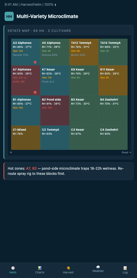
HarvestHelm treats canopy microclimate mapping the way a yacht navigator builds a chart of coastal currents — dense enough to distinguish safe channels from hazardous ones, updated continuously as conditions shift. The helm-charted yield forecast starts with a sensor grid at roughly 200-metre canopy resolution, each node capturing RH, temperature, leaf wetness, and PAR at canopy-interior height. The dashboard renders these readings as heat-map layers overlaid on the plantation block diagram, with time-slider controls for examining patterns across the diurnal cycle, flush phase, or pre-monsoon build-up. A captain does not navigate by a single depth reading — the captain reads the chart across the passage, and that is exactly how microclimate mapping should work across a plantation.
The sensor grid architecture benefits from established IoT deployment patterns. Nature Scientific Reports research on IoT sensors in precision agriculture documents technical guidelines for sensor placement in orchard environments, including spacing intervals, canopy depth, and network topology. HarvestHelm uses LoRa-based communication between canopy sensors and the plantation gateway — research from MDPI on orchard LoRa communication confirms that LoRa achieves reliable 120-metre packet delivery through dense orchard canopy, with additional gateways required beyond that range. On a 100-acre plantation, three to four gateways combined with roughly 80 canopy sensor nodes provide the coverage density needed for cultivar-level microclimate mapping.
Data pipeline design matters as much as hardware density. ScienceDirect research on Ag-IoT pipelines breaks the pipeline into collection, storage, and visualization layers, each with its own design requirements. HarvestHelm's dashboard renders the visualization layer as three synchronized views: a raw heat-map of current conditions, a cultivar-overlay that colours the map by per-cultivar infection risk, and a time-series view showing how the heat-map has shifted over the past 72 hours. Plantation managers who extend microclimate mapping across varietal plots often tie the heat-map to Tommy Atkins panicle sensors for bloom-phase validation and to multi-acre canopy telemetry for larger-scale deployments.
The cultivar-specific overlay is where the map delivers operational value. An Alphonso block showing canopy RH of 94 percent with leaf wetness of 4.5 hours triggers the anthracnose alarm at a lower threshold than an adjacent Tommy Atkins block at the same readings, because Alphonso is rated more susceptible in the ScienceDirect screening of mango cultivars against anthracnose. The dashboard computes cultivar-adjusted infection risk per sensor node and renders the map accordingly. Same weather, different risk, different recommended action per block. WSU Tree Fruit research on mapping orchard variability confirms that spatial mapping enables site-specific management decisions that uniform treatment cannot match.
Advanced Tactics for Plot-Level Microclimate Intelligence
The advanced tactical layer turns a static map into a dynamic decision instrument. The first tactic is micro-topography integration. A 2-metre elevation drop in the plantation creates a measurably different cold-air drainage pattern in the canopy, with lower elevation rows accumulating moisture and cool air overnight. HarvestHelm's dashboard ingests plantation elevation data (from drone photogrammetry or LiDAR) and weights microclimate interpolation accordingly, so the map respects the physical reality that air flows downslope rather than spreading uniformly. This matches the approach that mountain apple growers use for cold-air drainage mapping and it extends to mango plantations wherever subtle topography shapes disease pressure.
The second tactic is shade-coefficient correction. Canopy depth varies with pruning age and cultivar — an established Alphonso canopy casts roughly 80 to 88 percent shade on the interior at mid-canopy height, while a younger Tommy Atkins canopy might only cast 65 to 72 percent. The shade coefficient modulates how much solar radiation penetrates to panicle level, which directly affects panicle temperature and the evaporation rate of surface moisture. HarvestHelm integrates PAR sensor data with canopy depth estimates to compute a per-block shade correction factor, refining the infection risk estimate beyond what RH and temperature alone can capture. Desert date palm growers running a parallel playbook have similar needs documented in hyperlocal date sensors work, where canopy-specific microclimate also drives variety-level decisions.
The third tactic is temporal map differencing. A microclimate map that shows current conditions is useful; a microclimate map that shows how current conditions compare to the same day last year is a planning instrument. HarvestHelm's dashboard stores 3 to 5 years of sensor history and renders difference maps on request — "show me where canopy RH is running 4 percentage points above the same date last year." Those difference maps catch systemic shifts in pre-monsoon pressure that might not trigger a single-event alarm but add up to a changed risk profile across the season. The difference maps become the long-term navigation chart for the plantation rather than just the day-to-day instrument panel.
Sensor Deployment Patterns That Avoid Common Coverage Gaps
Most plantations that build out canopy sensor networks discover coverage gaps in their second season that they could have avoided with better first-season deployment planning. The first common gap is edge-effect blind zones. Blocks at the plantation perimeter experience measurably different microclimate from interior blocks — more wind, faster canopy drying, stronger solar exposure on the sun-facing edges, stronger shade penalty on the shaded edges. Sensor networks designed on a uniform grid miss these edge-effect differences because the grid spacing is optimized for interior conditions. The fix is deploying 20 to 30 percent extra sensor density along the first two rows of each plantation edge, creating a denser perimeter mesh that captures the edge-effect gradient.
The second common gap is shade-pattern blind zones under dense Alphonso canopy. Mature Alphonso trees cast 80-plus percent canopy shade, creating internal microclimate zones that sensors placed at mid-canopy height capture reasonably well but sensors placed at panicle height miss entirely. HarvestHelm recommends paired sensor placement on mature canopies — one at mid-canopy height for general microclimate and one at panicle height for infection-window detection. The paired placement costs 1.7x the single-sensor deployment but captures the actual panicle environment where disease pressure accumulates.
The third common gap is windward-leeward differential on blocks adjacent to prevailing wind corridors. Coastal Konkan plantations experience strong sea breezes that create measurably different microclimate on the windward versus leeward side of large blocks. A sensor network blind to this differential misses the wetness-persistence gap between the two sides, under-treating the leeward side where wetness lingers. Adding wind-direction-aware sensor placement in the first season avoids rebuilding the network in year two.
Mapping the Canopy Is Mapping the Margin
Canopy microclimate mapping is not a research exercise — it is the foundation that every downstream operational decision depends on. Spray timing, labour staging, harvest pull-forward, and export routing all require an accurate read of what each block is actually experiencing, cultivar by cultivar. A plantation running a single met station is navigating with a sketch map of the coast; a plantation running a dense canopy sensor grid is navigating with a full chart. HarvestHelm's kilo-cut monetization means the platform earns only when export-grade fruit clears — so the dashboard's mapping recommendations carry exactly the grower's financial incentive. Mixed-cultivar plantations in Krishnagiri, Kolar, and Ratnagiri that have built out proper canopy microclimate maps report 15 to 22 percent reductions in rejection rates across cultivars, with the biggest gains on the most susceptible varieties. The canopy is not uniform. Your map should show you exactly where it isn't.